- October 5th, 2025
Make Your Cleveland Website Work Better This Fall
As fall takes hold in Cleveland, routines start to shift. People spend more time indoors, evenings feel a little longer, and screens get more attention. It is not just about the weather. Shopping habits change, and so does the way people connect with local businesses. Whether they are tucked under a blanket on the couch with a tablet or checking their phone while waiting at school pickup, the way they view and interact with websites is different this season.
That is where responsive web design in Cleveland makes a real difference. It is not just about good looks. Responsive web design helps your website meet real people where they are, no matter when or how they visit. Maybe they are scrolling after dinner, comparing store hours, or buying a last-minute ticket to an event. If your site cannot keep up with those needs, it may get passed over. This season brings small shifts that are surprisingly important, and having a site that adapts can set you apart.
How Fall Shopping Habits Impact Website Performance
As September becomes October, Cleveland shopping patterns change. This is not just about Black Friday or Halloween. Fall weekends fill with markets, school activities, football games, and art walks, and shoppers go online at odd hours. Some browse during short breaks at those events. Others look late at night as families talk about holiday plans.
These visits are short and focused. People make quick comparisons or check for a deal, then move on. A slow website or one that looks odd on a phone sends those visitors away. The window to grab attention is tiny. If your menu is hard to tap or if something loads off screen, you risk losing the sale even with local shoppers who did want to buy.
Cleveland buyers also come online after events to look up something they saw in person. That moment matters. If your website gives them an easy way to check inventory or details, you get another chance to connect—right then, not later when the memory has faded.
Responsive web design in Cleveland meets these habits head-on. Sites can include mobile-friendly menus and service pages that adjust to fit almost any screen. Local businesses can partner with designers who know how to speed up page loading and create layouts that make sense for the busiest part of the year.
What Responsive Design Really Means Today
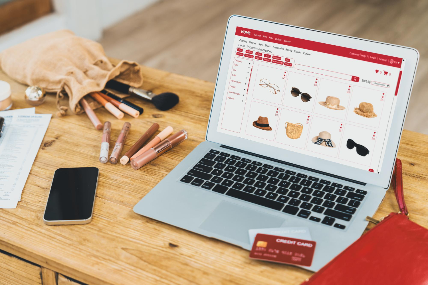
Responsive design is not just about shrinking a site to fit. Today, it means building sites that just feel right no matter what device someone uses. Whether a shopper grabs a desktop at work or flips their phone sideways at dinner, the site should simply work.
A responsive website for Cleveland businesses might have:
- Flexible page layouts that look clean and work upright or sideways.
- Large buttons for actions like “Buy Now,” “Get Directions,” or “Order Pickup.”
- Text that always stays easy to read without zooming.
- Images sized to load quickly, even with a weak Wi-Fi or cellular signal.
- Forms that stay easy to use, even with a touch keyboard and small screens.
This smooth experience means Cleveland visitors are more likely to click through more pages, shop for longer, or fill out your online forms. With a responsive site, you make each visit feel easy—and that adds up.
Some web companies provide extra features for their Cleveland clients. Yorty Designs Professional Marketing and Advertising, for example, offers web design with built-in editing tools. This lets employees at local businesses update text, swap photos, or add information about seasonal sales without needing to contact a developer.
Common Problems Businesses Face Without Responsive Design
Problems with poorly designed websites show up fast once fall gets busy. These issues are easy to notice both for customers and owners:
- Navigation menus that overlap, are too small to touch, or just vanish on phones.
- Product pages that break when a user turns their device from portrait to landscape.
- Forms that stop working halfway, so the shopper has to start again from scratch.
A site that is hard to use will drive customers away. Not only does that hurt real sales, but it can also drop your rankings in search results. Google likes sites that work smoothly on mobile devices. When people leave your site too quickly, the search engines notice. This can mean less online visibility just when you care about it most.
Returning customers can disappear too if hurdles stack up every time they visit. During fall, buyers want less friction, not more distractions. Cleveland locals appreciate a business site that just works on their phone or tablet, especially when they are short on time.
The best responsive web design in Cleveland helps reduce abandoned carts, broken forms, and lost sales by using clean layouts and solid navigation tools tested on real devices. On top of that, some web providers integrate common business tools like contact forms and image galleries to match the actual needs of Northeast Ohio businesses.
Why It Matters Now for Cleveland Businesses
Cleveland feels busier in the fall. Every weekend hosts a new event, market, or festival. People decide quickly where to eat, shop, or unwind based on quick searches and fast impressions. Whether they are looking up your menu before heading out or checking sales on the spot, they rely on their phones first.
Fall is the season when site problems stand out. At a festival or a vendor market, new shoppers see your brand for the first time. If you want them to keep coming back, your mobile presence has to make a good impression. Before telling friends or coming back, shoppers will almost always view your site first.
If a website makes it tough to find contact info or menu options, you lose your spot on their list. When traffic spikes for the holidays or after big Cleveland events, your layout must stay solid so you do not lose hard-won visitors. Fast, responsive websites feel easier to trust, especially for buyers who are comparing several spots on the go.
Responsive web design in Cleveland is not only about tech details. It sends a signal that you care about the shopper experience. This holds even more weight during fall, with so many families and shoppers moving quickly from place to place.
A Smarter Setup for a Busy Season
As the days get shorter and events stack up, Cleveland businesses feel the push. By mid-October, it is full speed into fall festivities and holiday prep. A responsive website gives you more than a modern look. It helps pages load the right way for any person, on any device, keeping your business open to everyone, everywhere, all season long.
If your website rises to meet customers in all the ways they shop, you stand a better chance at building repeat visits and stronger sales as the year winds down. For Cleveland shops and service providers, adapting your web setup is not just good sense. It is right on time for fall.
At Yorty Designs Professional Marketing and Advertising, we know how much fall can shape online habits in Cleveland. When your site runs smoothly during late-night browsing or weekend traffic spikes, it’s more likely to turn interest into real action. If mobile visitors aren’t sticking around, it might be time to rethink your setup. One smart move is with responsive web design in Cleveland that fits real screens, real moments, and how people actually shop. Let’s talk about making your site easier to use and harder to ignore this season.